

Showing posts with label coral. Show all posts
Showing posts with label coral. Show all posts
Wednesday, March 23, 2016
SETTING THE TABLE FOR EASTER
It's just me hippity hopping by with an easy Easter tablescape! Come on over and take a peek. It all started with my furry bunny friend.........

Monday, September 14, 2015
TLB IN THE PRESS
Good Morning Friends!
It's a great morning to grab your coffee and start your day
with TLB & HGTV's October Magazine....come on over as I
share a snippet of press with all of you.....
Monday, May 18, 2015
SWEET TABLESETTING BY THE LAKE
I love these sunny warm days we have been having. I've been dying to do a photo shoot by the lake in our backyard. It's so beautiful this time of year and makes such a lovely backdrop, especially for a tablescape.
I started with my coral tablecloth. Of course I needed a colorful bouquet of flowers, so off to Publix I went. They had just what I needed. The yellows, purples, oranges, and lime green were just the perfect compliment to the placesettings.

The placemats, luncheon plates and coffee mugs are from my favorite HOMEGOODS store. I love the fun edge around the placemats. The colors sprinkled throughout are just perfect. My goblets were a recent find in DOLLAR GENERAL, yes, true....$1.00 each and they are very nice quality!

The white pitcher I am using for a vase is from HOMEGOODS.

The pattern on the coffee mugs and luncheon plates adds just the right amount of corals in various depth to compliment the yellow placemats and napkins.

Here it is.......all set for our girls luncheon on this lovely day!

I started with my coral tablecloth. Of course I needed a colorful bouquet of flowers, so off to Publix I went. They had just what I needed. The yellows, purples, oranges, and lime green were just the perfect compliment to the placesettings.

The placemats, luncheon plates and coffee mugs are from my favorite HOMEGOODS store. I love the fun edge around the placemats. The colors sprinkled throughout are just perfect. My goblets were a recent find in DOLLAR GENERAL, yes, true....$1.00 each and they are very nice quality!

The white pitcher I am using for a vase is from HOMEGOODS.

The pattern on the coffee mugs and luncheon plates adds just the right amount of corals in various depth to compliment the yellow placemats and napkins.

Here it is.......all set for our girls luncheon on this lovely day!

Thanks for joining me today. I hope you enjoyed your visit.
Kathleen
Monday, May 4, 2015
UPCYCLE PICTURE PROJECT
Good Morning Monday friends!
I hope you all had a great weekend. We enjoyed a couple days with our oldest daughter and her new puppy. She took her Dad out deep sea fishing yesterday so we ended up having a delicious fish dinner last night. Nothing like fresh caught fish!!
Today's blog isn't about food, it's all about recycling. When we do home renovations I really love to recycle some of things that I already have. As I looked around the house I thought I would start with an easy project and upcycle some of the picture frames in our living room.
Here is what I started with:

We have two of these similarly framed botanicals above our sofa. At the time (11 years ago) I was in to the Tommy Bahama theme, using much darker woods. But I've fallen in love with Navy, Coral and White....so here is how I started the transformation.
I went to Benjamin Moore and picked out a complimentary blue in the same family as our newly painted front door. (Blog to come in the near future on this!)


Ben Moore paint is so great, I only needed one coat. I also added a bit of gold paint to the inner edge of the frame. I had some Craft Smart Metallic Gold from Michaels on hand that worked perfectly.
I carefully separated the mat board from the board that the print was glued to. My hubby spray painted the old brownish mat white for me, which looks terrific with the coral.

I sprayed the back of the new coral print with Spray Adhesive and pressed it securely into place directly on top of the other print. I purchased my prints from Elizabeth at The Beach House Gallery on Etsy. She is awesome to work with!
https://www.etsy.com/shop/BeachHouseGallery

Then we placed the newly painted white mat on top and secured them into the newly painted frame.


I'm so happy with the outcome. The living room is already starting to take shape with my new color palette. A little application of paint and some elbow grease sure can turn into something beautiful! I LOVE that feeling of satisfaction when I look at projects like these side by side.....you can do this too! Take a peek around your house and share your projects with us!
Don't forget to follow TLB weekly as the renovations continue on the house!
I hope you all had a great weekend. We enjoyed a couple days with our oldest daughter and her new puppy. She took her Dad out deep sea fishing yesterday so we ended up having a delicious fish dinner last night. Nothing like fresh caught fish!!
Today's blog isn't about food, it's all about recycling. When we do home renovations I really love to recycle some of things that I already have. As I looked around the house I thought I would start with an easy project and upcycle some of the picture frames in our living room.
Here is what I started with:
We have two of these similarly framed botanicals above our sofa. At the time (11 years ago) I was in to the Tommy Bahama theme, using much darker woods. But I've fallen in love with Navy, Coral and White....so here is how I started the transformation.
I went to Benjamin Moore and picked out a complimentary blue in the same family as our newly painted front door. (Blog to come in the near future on this!)
Ben Moore paint is so great, I only needed one coat. I also added a bit of gold paint to the inner edge of the frame. I had some Craft Smart Metallic Gold from Michaels on hand that worked perfectly.
I carefully separated the mat board from the board that the print was glued to. My hubby spray painted the old brownish mat white for me, which looks terrific with the coral.
I sprayed the back of the new coral print with Spray Adhesive and pressed it securely into place directly on top of the other print. I purchased my prints from Elizabeth at The Beach House Gallery on Etsy. She is awesome to work with!
https://www.etsy.com/shop/BeachHouseGallery
Then we placed the newly painted white mat on top and secured them into the newly painted frame.
I'm so happy with the outcome. The living room is already starting to take shape with my new color palette. A little application of paint and some elbow grease sure can turn into something beautiful! I LOVE that feeling of satisfaction when I look at projects like these side by side.....you can do this too! Take a peek around your house and share your projects with us!
Don't forget to follow TLB weekly as the renovations continue on the house!
Have a terrific Monday!
Kathleen
Monday, April 13, 2015
Relaxed Living
Good Morning Monday friends!



The past few months have been so busy and jam packed full of lists upon lists of "things to do," it's been so nice to take some time with hubby to decompress. (Explaining all of this will take a full blog some day!) I know this calm will not last forever, but for the moment, this "relaxed living style" is just what we needed.
As my head's coming out of the sand, and my creative juices are once again flowing, it's time to tackle some of the updating that I mentioned in my previous blog. I find so much inspiration from my surroundings. This vignette kind of sets the tone for our southern home.
I'm still working on that "first impression" foyer. I was invigorated after just rearranging items from different areas of the house, but then I felt it needed a bit more pizazz to bring it up to my vision.
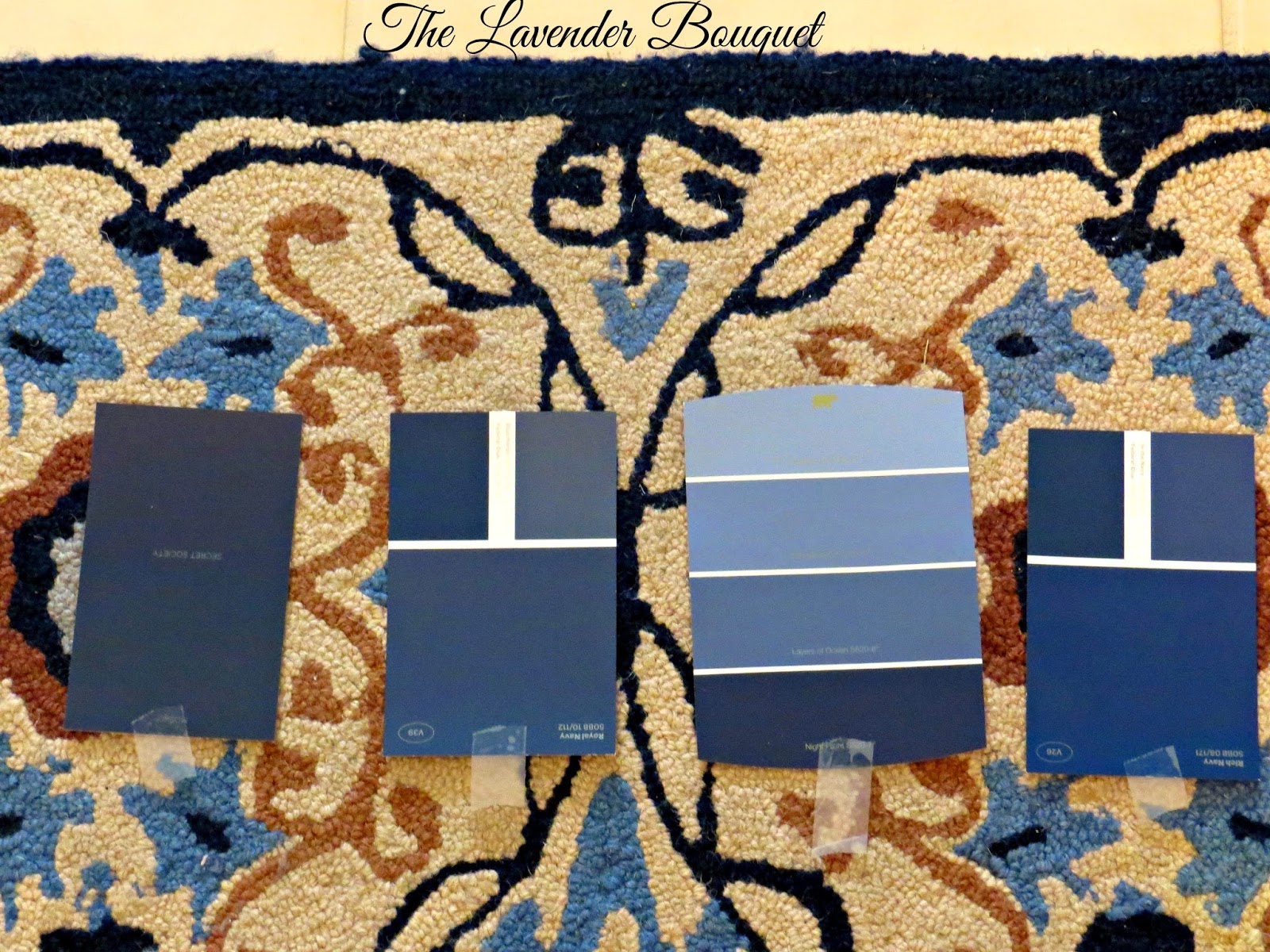
I purchased an area rug a couple of years ago with the intention of expanding the navy color palette throughout the house, little by little. I'm a big navy fan and am in love with the new corals. It appears that I'm not alone. Coastal stores are full of my new palette.
This is the design in my rug and some of my navy paint choices. I'm taking a very bold step into the unknown because of a gorgeous photo that I found in a magazine. The inside of the foyer door was painted a very deep navy blue. It was in a much larger luxe home, but I loved it so much......I thought I would give it a try. What a great unexpected surprise as you enter the house! Let's not forget that "big surprises" can come in "small packages!"
I had no idea there were so many different shades of navy. These are a few samples I picked up at Home Depot. My wall color does not photograph well....it is really kind of a sun kissed cream.
Picking the right navy with limited lighting is tricky. As with most colors they tend to look entirely different when you bring them into your own home. Lighting is key! Everyone has obstacles to work around, and honestly I only want to paint it once so that I can move on to other fun projects!
Now the work begins! Follow me as I share my journey to "relaxed living" with you!
Wishing you a wonderfully relaxing day!
Kathleen
****** Don't forget to follow TLB on Facebook, Instagram and Hometalk!
Subscribe to:
Posts (Atom)